
Tags
Art, artist, christianity, death, Dracula, Edgar Allan Poe, explanation, Literature, Painting, Portrait, self-portrait, symbolism

Wendy Brydge – “Self-Portrait of the Artist at Twenty-Five” – 2014
Every painting begins with an idea.
Rod Serling once said, “The instinct of creativity must be followed by the act, the physical act of putting it down for a sense of permanence. Once you get that prod, that emotional jar, that “I have witnessed something.” Or “I have felt something.” Or “I have seen something.” Or, through observation, “I have been moved by an event.” I think the answer is, “Get it down. Get it down quickly. Write it down.”
That right there is the best advice any artist — be they writer or painter — will ever receive. When you get that magical *spark* in your mind, that little glimmer of inspiration? You grab it, hold tight, and run with it as far as it will take you.
Ideas build on ideas. But inspiration can be fleeting. Maybe you see an image in your head as you’re drifting off to sleep at night. Or perhaps you read something interesting, or hear something unusual, and it makes you want to process and use that information somehow. When that happens, I urge you to do as the talented Mr. Serling said: GET IT DOWN. Any and all of it. Before it’s gone.
* * * * *
I’ve always found portraiture to be a fascinating study. And I have an undying love of still life paintings. One thing I always thought would be interesting is combining the two.
In January 2012, I completed the following commission piece:
“Still Life Portrait: Megan”

Wendy Brydge – “Still Life Portrait: Megan” – 2012 – 14″ x 18″
The painting was commissioned by the parents of a good friend as a surprise gift for her upcoming birthday. The only problem was that they had no idea what I should paint. So I pondered. I thought about what Megan’s tastes were, what I thought she’d enjoy, and what things made me think of her. And then inspiration hit me like a ton of bricks, right out of the blue — a still life portrait. A painting that encapsulated what made Megan, MEGAN. A symbolic representation of my friend. Not just the things she liked, but the things and character traits that make her unique.
A good painting should make you think and ask questions, and more importantly answer those questions. This painting isn’t just something pretty for Megan to look at and enjoy. No, it has the added bonus of SHOWING people who Megan is. Like a little snapshot of her “essence”. She loved it, her parents (who footed the bill!) loved it, and it’s one of my personal favourites too.
In fact, I liked it so much that I simply had to paint one for myself.
Every artist thinks about a self-portrait at some time in his life. And I’d been designing and redesigning mine for a number of years. My favourite self-portrait is Albrecht Dürer’s 1500 “Self-Portrait at Twenty-Eight” (which is what I’ll be turning in a few days).

Dürer’s richly-coloured Christ-like portrait is what helped inspire my never-completed original self-portrait design seen here. But this new prospect of a visual representation of ME told through objects, tone and atmosphere instead of my face alone was so deliciously exciting that only a week after I finished my portrait of Megan, I began designing my own.

As I said, every painting begins with an idea. And the only logical way to decide what things would make the final cut in my self-portrait was to write down every little thing that came to mind. Anything that could potentially go into the painting was put to paper. Write first, purge later.
As you can see from the above photo of my notebook, I started out with a huge list of possible candidates. I’ve pointed out before that when creating a painting, 50% of the work happens before a drop of paint ever touches the canvas.

I work out all the details on paper first, making notes and sketches and deciding on specifics. It’s very efficient, but it’s also necessary for someone like me who craves order and organization, and who needs to SEE something concrete on paper before making it a reality.
One of the most important aspects of a painting (or blog post!) is the title. I know many people don’t fuss over titles, but to me, they’re of great importance. Especially 100+ years down the road when your masterpiece is found in some long-abandoned attic, and the first thing everyone wants to know is, “What’s this about?” When you aren’t there to answer, a well-chosen title can do it for you.
When I began this in February 2012, I was 25 years old. Twenty-five sounded like as good a time as any. So I titled this painting, “Self-Portrait of the Artist at Twenty-Five”. The goal was to have it completed before I turned 26 that August.
Needless to say, THAT didn’t happen. A number of personal issues factored into the delay, but what was important was that the design reflected me, as I was, at age 25. The completion date would have no bearing on that, and I did finish the design within a month of starting this project.

Yes, yes, there are Christmas decorations in the background. Why? Because at my house, February is still too early to take them down. Don’t judge me.
Normally when designing a painting, I take/find photographs of the individual items, sketch each one separately (or in a small grouping if the items are already scaled correctly), and then I digitally create the composition I like. This allows me the freedom of easily moving items around and resizing them, without committing myself to the first attempt, or having to re-sketch everything each time I make a dramatic change. But this special piece lent itself to a traditional still-life set-up, as you see above. To be able to SEE most of the elements IN THEIR element, so to speak, was incredibly helpful to visually-oriented me.

Having a physical “set” allowed me to really get in there and see ahead to the final composition layout. I selected books for my set-up based on their size and shape, then changed the spines later to the books I wanted them to be. One of the nice things about art — if it doesn’t exist, or you can’t find exactly what you want? You just MAKE it.
After much deliberation and item whittling, this is how my final design looked.


The full-size template
The two main differences between my still life and the one I painted of Megan are the orientation (hers is a vertical portrait style, mine is a horizontal landscape), and more importantly, the background colour.

October 8, 2012
Making my background black added a tremendous amount of work to this piece. As I explained in a previous post, the graphite paper I use for transferring my image from template to canvas, DOESN’T show up on black. So painting the entire 16″ x 20″ canvas black first wasn’t a viable option. But black backgrounds are definitely me, so I did the transfer and then painted AROUND the image.
But enough technical talk. How about a look at the overall painting as it progressed? Click on any image to open a nifty slideshow view of the images that you can then scroll through!
-

- May 20, 2013
-

- June 4, 2013
-

- September 27, 2013
-

- October 3, 2013
-

- November 6, 2013
-

- November 15, 2013
-

- January 3, 2014
-

- May 6, 2014
-

- June 2, 2014
-

- July 9, 2014
-

- July 12, 2014
-

- July 15, 2014
-

- July 21, 2014
Every painting is a labour of love, but this one more so than most. I mean, this painting IS ME. And I had so much fun designing it.
Allow me to delve a little deeper for you and point out some of the items, as well as the fun symbolism I “hid”. Plenty of my likes are obvious. I adore books. Real books. Made of out paper and stamped with ink. Practically every room in my house has a bookcase. Here I highlighted my favourites: Peter Pan, Sherlock Holmes, Dracula, and Dante; Hamlet – my favourite Shakespeare play, and of course my very first (and favourite) Nancy Drew mystery. A book on Da Vinci, one of my beloved Encyclopedia Britannicas, and “Bitten”, the first book by my favourite author, Kelley Armstrong. The Latin inscription on the remaining book, “Non Timebo Mala”, means “I Will Fear No Evil”. I’ve always had a penchant for Latin phrases and this line from the 23rd Psalm was one I definitely wanted in the piece. (It also happens to be inscribed on the Winchester Colt in the television show Supernatural, which I’m a big fan of.)

The open book is an illuminated manuscript — another type of book I have a passion for. A little Christian symbolism on the page and it became more recognizable than just a Bible, which is what it began its life as on paper.

I’m a girly-girl. I like things that are shiny, sparkly, pretty, and pink. So naturally, I also love flowers. Lilies and orchids are among my favourites. I wanted the painting to have a very full and rich feeling to it, all while maintaining a strong sense of delicate femininity. The flowers, the two nail polish bottles (the only two colours I actually use!), the perfume bottle (Beyoncé’s “Heat Rush” — my signature scent!), and that empty ornate frame, all give the piece a soft touch of glamour to help balance the heaviness of the books and other “harsher” elements.
And the sweet peas behind the perfume bottle have a completely personal meaning. My dad has called me “Sweet Pea” since the day I was born.

Paint bottles, tubes, an empty palette (always looking forward to my next new project), and brushes (modelled using actual items I use practically every day) were a necessity in a painting that represents an artist. And what better way to celebrate my being a proud Canadian than with a maple leaf. In fall colours, as that’s my favourite time of year.

Another reason this still life self-portrait type of painting is so interesting, is that you really get a good sense of how your tastes can change within just a matter of a few years. If I were redesigning this painting today, my beloved Doctor Who sonic screwdriver (the 10th Doctor’s, of course! David Tennant — forever the ONLY Doctor!) sadly would not make the final cut. To add a little “life” to the painting, I chose to have the screwdriver emitting its familiar blue glow.
Now how about that skull? Magnificent, isn’t it? Sorry, I enjoy skulls. I really do. A lot of the wonderful classic still life paintings I like so much have a skull in them. And the fact is, I just plain wanted one in mine. They look cool. I’ve always been fascinated with them. A replica human skull (which this one was modelled after) has been sitting in my library for as long as I can remember. The nicest thing about the skull though is that it’s so incredibly symbolic, that I can list a number of secondary reasons I included it in this piece. I was really into BBC’s Sherlock at the time I painted this, and HE had a skull on his mantelpiece. There’s the skull of Yorick in Hamlet, and when you view the skull in conjunction with the bird perched on top of it? Well, that’s just a whole other barrel of fun.

Fan of my blog? Then you know how much I adore Edgar Allan Poe’s haunting poem, “The Raven“. “In there stepped a stately Raven… perched upon a bust of Pallas just above my chamber door…” The skull, the chickadee, and the raven’s feather is my little artistic twist on this classic image from Poe. I have a number of wild chickadees that I’ve tamed over the years (see the last pic on my About Wendy page), and sometimes those little guys exhibit the “mien of lord or lady”! Like the squirrel in this painting (Cutie Pie), these wild creatures are my “pets”, and they needed to be a part of my self-portrait. Also note the writing nib I added to the raven’s feather the chickadee is holding. Another nod to Poe, the writer, and also a little acknowledgement of my own dabbling with the written word.

Another staple of a classic still life painting is some ripe, juicy fruit. I chose the orange and strawberries for two reasons. Firstly, they do happen to be my favourites. But also, it was an aesthetic choice. Orange and red in that spot is what looks best. Green kiwis or yellow bananas just wouldn’t be a good fit here. This complements what’s in the immediate area, and also adds to the overall colour harmony of the piece. That’s something artists should remember when working: Even though you may be focusing your attention on one small area at a time, you must always be thinking of the piece as a whole. Balance and harmony are achieved not only through what you put and where, but are also reliant on the colours you use.
On the scroll is one of my favourite Bible verses, Psalm 119:105: “Thy word is a lamp unto my feet, and a light unto my path.” A name/scripture verse plaque hung on my bedroom door while I was growing up, and this was the verse paired with my name, which may help explain my fondness for it.

I’m infatuated with classic statuary. Every day I enjoy the three pieces of it that grace my studio. One of the most beautiful and recognizable statues in the world is Michelangelo’s David.

Naturally I wanted to pay tribute to one of the world’s greatest artists. But what’s special about this element of the painting is the inscription on the David statue’s base: MCMLXXXVI, which is 1986 — the year I was born — in Roman numerals. I added the banner to him so that I could include my favourite Bible verse, Psalm 27.
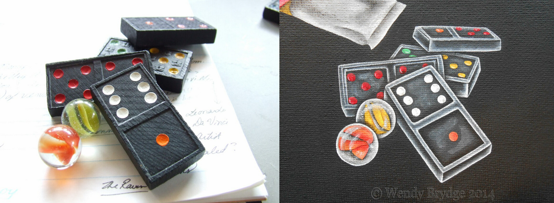
The most meaningful element of my self-portrait is the little pile of dominoes and marbles. I grew up playing dominoes and Chinese Checkers with my grandma Brydge. Those two games are our thing. The items pictured in the painting are the actual dominoes and marbles we used — she was always the yellow marbles, and I was always the orange. And the best part of the whole painting, the one thing that ties it all together and made me feel incredibly clever and sneaky? The visible dots on the dominoes add up to twenty-five. *bows low*
What is it about portraits that makes them so endearing? Be it a portrait painted or photographed, an actual representation or something more symbolic like this painting? My answer to that question is in the tagline above my signature.

“Non Omnis Moriar” — I Shall Not Die.
Portraits have a sense of permanence to them. What’s portrayed in them is a tiny flicker of immortality. They take that which will die or that which is already dead, and keep it alive and even bring it back to life. As long as my portrait exists, does not a part of me still live? Leonardo Da Vinci said, “How many paintings have preserved the image of a divine beauty which in its natural manifestation has been rapidly overtaken by time or death. Thus, the work of the painter is nobler than that of nature, its mistress.” Everything mortal dies. The flesh passes away, but the spirit exists for eternity. I believe that portraits are our modest way of trying to capture and hold onto that which is fleeting. An artist spends his days searching for the spark of life, and when he finds it, he does the only thing he knows to do: He paints it. He gets it down. And quickly. As quickly as he can anyway. He writes it down in paint. For is not life itself the greatest inspiration of all?
As Henry Ward Beecher wrote, “Every artist dips his brush in his own soul, and paints his own nature into his pictures.” So isn’t there a piece of the very soul itself in an artist’s self-portrait? And the soul never dies. It lives on forever.
~ Non Omnis Moriar

I had this beautiful frame (which I restored myself) picked out for my self-portrait before I designed it. How you frame a piece of art is just as important as the art itself. For me, this was a perfect pairing. The frame neither overpowers nor underwhelms the piece. The two just complement each other nicely.

Excellent post, GF! Reading it gave me the same enjoyment that I got when I first read your “Armageddon” series. One might assume that only a fellow artist would be able to glean anything from this type of post, but that’s not true. This should interest anyone who’s involved in a creative field. My own artwork may be limited to stick figures, but I know how to “paint” with words. And seeing the ways in which others pursue their passion, and express themselves through their chosen medium, is something I’ve always found interesting. This post is a great example of that.
And as you well know, I’ve always been fascinated by behind-the-scenes information. From music to painting to TV shows, I like learning more about what went into the things I enjoy — and why. It’s easy to assume that things spring from someone’s brow fully conceived, but that’s not the case. A lot of thinking, along with a healthy dose of trial-and-error, goes into every true work of art. As I’ve told you before, I’m writing in my head long before I start tapping on a keyboard or scribbling in a notebook. I might be on a treadmill in the gym, but my brain is writing!
I feel especially privileged to have seen this painting take shape long before you published this post. In a sense, I’ve gotten a slideshow of my own, albeit it in the “slow-mo” of real time! Every time you added another element over the past year or so, I couldn’t help being impressed. And as I noted when you sent me a draft of this post earlier this week, it’s remarkable to see how your talent has progressed from the Megan painting to the one you’ve now done for yourself.
In the hands of a less talented writer, this could have been a self-indulgent mess. But my favorite blogger has written a post as impressive as the painting it’s based on, and given us all a helpful glimpse into the creative process. You’ve taken Serling’s advice (thanks for the link, by the way!) to heart and published a post that will indeed, as you say, live on. Thanks for that. :)
Thanks, Boss! It’s so interesting to see how the different artistic mediums are actually quite similar. Whether painting or writing, a lot of the same procedures and planning stages can be the same. The mind of an artist is the mind of an artist, I guess! Maybe we’re all wired in a similar way. :)
And I really enjoyed putting this post together. This was a major work for me and one that was clearly a lot more personal than a lot of the other pieces I do. I must admit, half the fun for me was sending you those “update” pics as time went on! You’re a fantastic cheerleader, I have to say! Thanks for all the compliments, your encouragement and excitement. You wanting to see the painting finished (not to mention this post!) helped make ME more determined to get it done, and to do a good job. As I’ve told you before, I consider you my Muse. :) And as such, any… “mistakes”… that I may or may not have had to fix, will remain our little secret. ;)
So glad you could be a part of this special piece, my friend. So thank YOU! :)
This is beautiful and such a comprehensive portrait of a young woman. I think you will enjoy looking back on this to see what changes, what evolves and perhaps what faded over time. It’s a great concept for a portrait.
As for Mr Serling’s advice, no surprise, I have to agree. I wake up often during the night only to grab my phone and peck down cryptic thoughts into Evernote.
I love poetry and Poe’s poems. As for dominoes, my daughter and I used to play genes with them, but not the game. Our favorite was to build forts out of them and try to crash through each other’s fort with a friction-motor little 4×4 truck.
I really appreciate that you explained the elements of the painting, and I liked that you showed us how it developed. It helps me to learn more about you. This is a great painting and a great post. Thanks for letting us in on the secret life of you at 25.
Wow, quite the in-depth psychological portraiture! Thanks for sharing so much about yourself. I’ve been writing down ideas since I was a kid, and on all manner of scraps…everything from toilet paper to electronic media. Think I still have some of the OLDER stuff, too! :-]
I think it was in Kevin Brockmeier’s The Brief History of the Dead that had a line or two in that said that as long as someone still thinks about you, talks about you, you’re not really dead. I found his relaying of that more interesting, and that entire book is one of my favorites, but it was a cool way to think about it! And your work will definitely keep people’s lives alive! Very nice!
It’s a shame you don’t have a donate button! I’d definitely donate to this fantastic blog!
I guess for now i’ll settle for bookmarking and adding your
RSS feed to my Google account. I look forward to new updates and will talk about this blog with my
Facebook group. Talk soon!
Pingback: Atlanta Retaining Walls
Pingback: slip and fall law in california
Pingback: Sunday Quotes, Birthday Notes | Seeker of Truth
Pingback: Gallery Feature: “Seagull” | Seeker of Truth
Pingback: Gallery Feature: Lenten Cross | Seeker of Truth